
Jul 4
Improve Visibility and Usability of Delete Button in Cart and Mini Cart
Dear WoodMart Feature Requests Team,
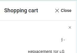
I would like to suggest an enhancement regarding the delete (remove product) button on both the cart page and the mini cart interface. Currently, the button appears quite small, which can make it difficult for users to interact with it efficiently—particularly on mobile devices or for users with accessibility needs. This sometimes requires repeated clicking or precise targeting, which may hinder the overall user experience.
To improve usability, I kindly recommend increasing the size of the delete button or redesigning it to be more user-friendly and accessible. Enhancements could include:
Enlarging the clickable area of the button
Using a more prominent icon or label
Ensuring better spacing to prevent accidental clicks on adjacent elements
Such improvements would greatly enhance the shopping experience and align with modern usability standards.
Thank you for your attention to this matter, and for your continued efforts in developing a high-quality theme.
Pending